
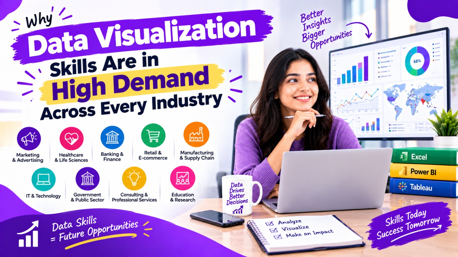
Businesses today generate and collect enormous amounts of data.
Customer transactions, website visits, sales records, financial information, marketing performance, employee data, inventory levels, production statistics, healthcare information, and operational reports are continuously being created.
But having data is not enough.
The real challenge is understanding the data and communicating what it means.
This is where data visualization becomes important.
Data visualization transforms complex information into visual formats such as charts, graphs, dashboards, maps, and interactive reports. Instead of reading thousands of rows in a spreadsheet, decision-makers can often understand important trends and patterns through a well-designed visualization.
Because almost every modern organization uses data for planning, reporting, monitoring, and decision-making, data visualization skills are becoming valuable across many different industries.
What Is Data Visualization?
Data visualization is the process of representing data visually so that people can understand information, relationships, patterns, trends, and comparisons more easily.
Common examples include:
- Bar charts
- Line charts
- Pie charts
- Scatter plots
- Area charts
- Histograms
- Heatmaps
- Maps
- KPI cards
- Interactive dashboards
- Business intelligence reports
For example, imagine a company has five years of monthly sales data.
A spreadsheet may contain thousands of individual records.
A line chart can quickly show whether sales are increasing, decreasing, or fluctuating.
Similarly, a dashboard can show:
- Total sales
- Monthly revenue
- Best-performing products
- Sales by region
- Customer growth
- Profit margins
- Year-over-year performance
This makes information easier to analyze and communicate.
Why Is Data Visualization So Important?
Organizations do not simply need more data. They need to make useful decisions from that data.
Data visualization helps bridge the gap between raw data and actionable information.
Makes Complex Data Easier to Understand
Large datasets can be difficult to interpret when presented only as tables.
Visualizations allow users to see relationships and trends more quickly.
For example, a sales manager may not immediately identify a declining product from a spreadsheet containing thousands of transactions.
A dashboard can make the decline visible through a trend chart or KPI indicator.
Helps Identify Trends and Patterns
Visualizations make patterns easier to spot.
Businesses can use charts to identify:
- Increasing sales
- Falling revenue
- Seasonal demand
- Customer behavior
- Marketing trends
- Product performance
- Operational problems
These insights can support better planning.
Supports Faster Decision-Making
Managers and business leaders often need to make decisions without manually analyzing every individual data point.
A well-designed dashboard can summarize important information and allow decision-makers to focus on key indicators.
Improves Communication
Data professionals often need to explain their findings to people who may not have technical knowledge.
A complicated analysis can be difficult to communicate using only numbers.
A clear chart or dashboard can make the same information easier to explain.
Makes Data More Accessible
Not everyone in an organization is comfortable working with spreadsheets, databases, or programming languages.
Visualization creates a more accessible layer between complex data and business users.
Why Are Data Visualization Skills in High Demand?
Several changes in the modern business environment have increased the importance of visualization.
Businesses Are Generating More Data
Companies collect information from many sources, including:
- Websites
- Mobile applications
- CRM systems
- Social media
- E-commerce platforms
- Financial systems
- Customer surveys
- Advertising platforms
- IoT devices
- Enterprise software
The amount of information available to organizations continues to grow.
As datasets become larger, organizations need effective ways to interpret them.
Data-Driven Decision-Making Is Becoming More Common
Businesses increasingly use data to support decisions related to:
- Marketing
- Sales
- Finance
- Operations
- Customer service
- Product development
- Human resources
- Supply chains
Data visualization helps decision-makers understand the information behind these decisions.
Dashboards Are Replacing Static Reports
Traditional reports may contain pages of tables and numbers.
Modern organizations increasingly use interactive dashboards that allow users to filter and explore information.
Tools such as Power BI and Tableau are widely associated with this type of business intelligence workflow.
Non-Technical Employees Also Need Data
Data is no longer limited to data scientists and IT departments.
Marketing managers, HR teams, finance professionals, sales teams, operations managers, and business owners may all need to understand performance data.
This increases the value of professionals who can create clear and useful visual reports.
Data Visualization Skills Across Different Industries
One of the major reasons visualization skills are valuable is their wide range of applications.
Data Visualization in Finance and Banking
Financial organizations work with large amounts of numerical information.
Visualization can be used for:
- Revenue analysis
- Expense tracking
- Profit analysis
- Financial forecasting
- Risk monitoring
- Investment reporting
- Customer analysis
- Transaction monitoring
Financial dashboards can help professionals monitor important indicators without manually reviewing large spreadsheets.
Data Visualization in Healthcare
Healthcare organizations generate large amounts of information related to patients, treatments, operations, and resources.
Visualization can support:
- Patient statistics
- Hospital performance
- Resource utilization
- Appointment trends
- Operational reporting
- Healthcare research
- Population-level analysis
For healthcare professionals and administrators, visual reports can make complex datasets easier to interpret.
Data Visualization in Marketing
Marketing is one of the areas where visualization can be particularly useful.
Digital marketers track many metrics, including:
- Website traffic
- Leads
- Conversion rates
- Click-through rates
- Advertising performance
- Social media engagement
- Customer acquisition
- Campaign performance
Instead of checking multiple platforms individually, marketers can use dashboards to bring important metrics together.
For example, a marketing dashboard may compare advertising spending with leads and conversions.
This can help teams understand campaign performance and identify areas requiring further investigation.
Data Visualization in Retail and E-Commerce
Retail businesses collect information about customers, products, stores, orders, and inventory.
Visualization can help analyze:
- Sales by product
- Sales by location
- Customer behavior
- Inventory levels
- Seasonal demand
- Average order value
- Product categories
- Revenue trends
An e-commerce company can use dashboards to understand which products are performing well and where sales are changing.
Data Visualization in Manufacturing
Manufacturing organizations generate data from production processes, machines, quality checks, inventory, and supply chains.
Visualization can help monitor:
- Production output
- Machine performance
- Quality metrics
- Downtime
- Production costs
- Inventory
- Delivery performance
- Operational efficiency
Manufacturing dashboards can provide managers with a consolidated view of operational performance.
Data Visualization in Human Resources
HR departments also use data.
HR analytics can include:
- Employee turnover
- Recruitment metrics
- Attendance
- Hiring trends
- Training participation
- Employee demographics
- Workforce planning
Visual dashboards can help HR teams identify trends and communicate workforce information to management.
Data Visualization in Education
Educational institutions can use visualization to analyze:
- Student performance
- Attendance
- Enrollment
- Course participation
- Examination results
- Graduation rates
- Faculty performance
Visual reports can help administrators identify patterns and areas that require attention.
Data Visualization in Technology
Technology companies generate data from applications, websites, software systems, cloud infrastructure, and customers.
Visualization can support:
- Product analytics
- User behavior analysis
- Website performance
- System monitoring
- Customer metrics
- Revenue reporting
- Technical performance
Data visualization can therefore be useful for both business and technical teams.
Data Visualization in Logistics and Supply Chain
Logistics companies manage information about transportation, warehouses, suppliers, orders, and delivery operations.
Visualization can help track:
- Delivery times
- Transportation costs
- Inventory
- Order volumes
- Warehouse performance
- Supplier performance
- Geographic distribution
Maps and dashboards can make geographic and operational information easier to understand.
Data Visualization in Government and Public Services
Government organizations also work with large datasets.
Visualization can support analysis of areas such as:
- Population
- Public services
- Infrastructure
- Budgets
- Education
- Transportation
- Economic indicators
Clear public dashboards can also help communicate information to citizens.
Most Important Data Visualization Tools to Learn
You do not need to learn every available tool.
Beginners can start with a few widely used technologies.
Microsoft Excel
Excel remains an important starting point for data analysis and visualization.
You can use Excel to create:
- Charts
- PivotTables
- PivotCharts
- Conditional formatting
- Dashboards
- Basic reports
Excel is particularly useful for beginners because it combines data management, analysis, and visualization in one environment.
Microsoft Power BI
Power BI is a business intelligence and data visualization platform used to create interactive reports and dashboards.
Important Power BI skills include:
- Data importing
- Data cleaning
- Data transformation
- Data modeling
- DAX
- Dashboard design
- Interactive reports
- Data visualization
Power BI is particularly relevant for people interested in business intelligence and data analyst roles.
Tableau
Tableau is another widely recognized data visualization and business intelligence platform.
It can be used to create interactive dashboards and explore data visually.
It is useful for professionals who need to analyze and communicate complex datasets.
Python
Python is useful when visualization is combined with programming and advanced data analysis.
Popular Python libraries include:
- Matplotlib
- Seaborn
- Plotly
Python can be particularly valuable for people who want to move toward advanced analytics, data science, or automation.
Data Visualization Is More Than Making Attractive Charts
An important point for beginners is that data visualization is not simply about making a dashboard look beautiful.
A professional data visualization should communicate useful information.
Good visualization requires understanding:
- The data
- The audience
- The business question
- The purpose of the report
- Appropriate chart selection
- Data accuracy
- Visual hierarchy
- Labels and context
- Dashboard usability
For example, choosing a complicated chart when a simple bar chart would communicate the information more clearly can make a dashboard less effective.
Important Data Visualization Skills to Develop
If you want to build a career in data analytics, visualization, or business intelligence, focus on more than software.
Data Cleaning
Before creating a visualization, data often needs to be cleaned.
You may need to handle:
- Duplicate records
- Missing values
- Incorrect formats
- Inconsistent names
- Incorrect dates
- Unnecessary columns
Poor-quality data can produce misleading reports.
Data Analysis
You should understand how to interpret data.
Important concepts include:
- Average
- Median
- Percentage
- Growth rate
- Distribution
- Correlation
- Variance
- Trends
Chart Selection
Different questions require different visualizations.
For example:
Bar chart: Useful for comparing categories.
Line chart: Useful for showing changes over time.
Scatter plot: Useful for examining relationships between variables.
Map: Useful for geographic information.
KPI card: Useful for highlighting important metrics.
Dashboard Design
A dashboard should be easy to navigate and understand.
Good dashboard design includes:
- Clear titles
- Logical organization
- Appropriate charts
- Consistent formatting
- Useful filters
- Important KPIs
- Limited unnecessary elements
Communication Skills
A data analyst should be able to explain what the numbers mean.
The goal is not simply:
“Here is the chart.”
The goal is to explain:
“What does the chart tell us, and why does it matter?”
Data Visualization and Artificial Intelligence
Artificial intelligence is also changing the way people interact with data.
AI-powered analytics tools can increasingly help users:
- Explore datasets
- Generate summaries
- Identify patterns
- Create visualizations
- Ask questions using natural language
- Generate analytical suggestions
However, understanding data remains important.
AI-generated analysis still needs human review for context, accuracy, data quality, and appropriate interpretation.
Therefore, learning data fundamentals and visualization can remain valuable even as AI tools become more capable.
Who Should Learn Data Visualization Skills?
Data visualization is not limited to people with advanced technical backgrounds.
It can be useful for:
- Students
- Graduates
- Data analyst aspirants
- Business professionals
- Marketing professionals
- Finance professionals
- HR professionals
- Sales professionals
- Entrepreneurs
- Business owners
- Operations professionals
- Researchers
- Working professionals looking to upskill
Someone who regularly works with reports, spreadsheets, KPIs, or business data can potentially benefit from visualization skills.
Career Opportunities Related to Data Visualization
Data visualization skills can contribute to several career paths.
Possible roles include:
- Data Analyst
- Business Analyst
- Business Intelligence Analyst
- Reporting Analyst
- Marketing Analyst
- Financial Analyst
- Operations Analyst
- Data Visualization Specialist
- BI Developer
- Data Consultant
The exact skills required vary by role.
For example, an entry-level reporting role may emphasize Excel and dashboard creation, while a business intelligence role may require Power BI, SQL, data modeling, and DAX.
Data Visualization Skills for Beginners
If you are starting from zero, you do not need to learn everything simultaneously.
A practical learning path can be:
Excel → Data Cleaning → Data Analysis → Charts → PivotTables → Power BI → Data Modeling → DAX → Dashboard Design → SQL → Projects
You can later add:
Tableau → Python → Advanced Analytics → AI-assisted Analytics
The exact order can vary depending on your career goal.
How to Build Practical Data Visualization Skills
Learning theory alone is not enough.
Practice with real datasets.
You can create projects such as:
Sales Dashboard
Analyze:
- Monthly sales
- Revenue
- Products
- Regions
- Customers
- Profit
Marketing Dashboard
Analyze:
- Website traffic
- Leads
- Campaigns
- Conversion rates
- Advertising performance
HR Dashboard
Analyze:
- Employee count
- Hiring
- Attrition
- Departments
- Attendance
E-Commerce Dashboard
Analyze:
- Orders
- Revenue
- Products
- Customers
- Average order value
Projects like these can help you understand how visualization is applied to practical business problems.
Why Data Visualization Is Valuable for Ahmedabad and Gujarat Professionals
Ahmedabad and other cities across Gujarat have businesses operating in areas such as manufacturing, finance, healthcare, pharmaceuticals, retail, education, logistics, IT, digital marketing, and professional services.
These organizations may work with sales, customer, financial, operational, and marketing data.
This creates opportunities for professionals who can combine:
Data + Analysis + Visualization + Business Understanding
Students and working professionals in Ahmedabad who want to move toward data analytics can consider learning Excel, Power BI, SQL, data visualization principles, and basic statistics as part of their skill development.
A practical data analytics or data visualization course in Ahmedabad can also provide structured learning through exercises and projects.
Data Visualization vs Data Analytics
These concepts are related but not identical.
Data Analytics focuses on examining data to discover insights and support decisions.
Data Visualization focuses on presenting data and insights in an understandable visual format.
For example:
A data analyst may analyze sales data and discover that sales are declining in one region.
Data visualization can then communicate that finding through a dashboard showing regional sales trends.
In many professional roles, both skills are used together.
Common Mistakes Beginners Should Avoid
Creating Too Many Charts
More charts do not automatically mean better analysis.
Use visuals that answer specific questions.
Choosing the Wrong Chart
A chart should match the type of information being communicated.
Ignoring Data Quality
Incorrect or incomplete data can lead to incorrect conclusions.
Making Dashboards Too Complicated
A dashboard should help users understand information, not overwhelm them.
Focusing Only on Design
A visually attractive dashboard is not useful if it does not answer a meaningful business question.
Ignoring the Audience
A dashboard designed for a data analyst may be different from one designed for a company director.
Always consider who will use the report.
Future Scope of Data Visualization Skills
As organizations continue adopting analytics, cloud platforms, automation, and artificial intelligence, the way people interact with data is changing.
Future data professionals may increasingly work with:
- Interactive dashboards
- Automated reporting
- AI-assisted analytics
- Real-time data
- Predictive analytics
- Natural-language analytics
- Cloud-based business intelligence
- Advanced data storytelling
The technology will continue to change, but the fundamental requirement remains similar:
People need to understand information and communicate insights clearly.
That is why data visualization remains an important skill within the broader data analytics ecosystem.
Frequently Asked Questions
What are data visualization skills?
Data visualization skills are the abilities required to convert data into understandable charts, graphs, dashboards, and visual reports. They include data analysis, chart selection, dashboard design, data storytelling, and knowledge of visualization tools.
Why are data visualization skills in high demand?
They are in demand because organizations generate large amounts of data and need professionals who can turn that information into understandable insights for decision-making and communication.
Which industries use data visualization?
Almost every data-driven industry can use data visualization, including finance, healthcare, marketing, retail, manufacturing, education, technology, logistics, human resources, and government.
Is data visualization useful for a data analyst?
Yes. Data visualization is an important part of many data analyst roles because analysts often need to communicate findings through charts, dashboards, and reports.
Which tool should beginners learn for data visualization?
Excel is a practical starting point for beginners. After gaining basic spreadsheet and analytical skills, learners can explore Power BI, Tableau, SQL, and eventually Python depending on their career goals.
Is Power BI a data visualization tool?
Yes. Power BI is a business intelligence platform that allows users to connect, transform, analyze, visualize, and report data through interactive dashboards and reports.
Do I need coding to learn data visualization?
Not necessarily. Beginners can learn visualization using tools such as Excel, Power BI, and Tableau without extensive programming. Coding with Python can be added later for more advanced analysis and visualization.
Can non-technical students learn data visualization?
Yes. Students and professionals from non-technical backgrounds can learn data visualization by starting with spreadsheets, basic statistics, data cleaning, charts, and dashboard creation.
What skills should I learn along with data visualization?
Useful complementary skills include Excel, SQL, statistics, data cleaning, Power BI or Tableau, data storytelling, business understanding, and communication.
Is data visualization a good skill for working professionals?
Data visualization can be useful for working professionals who regularly work with business reports, KPIs, sales information, financial data, marketing metrics, operations data, or spreadsheets.
Where can I learn data visualization in Ahmedabad?
Students and working professionals in Ahmedabad can explore structured data analytics or data visualization courses that provide practical training in Excel, Power BI, Tableau, SQL, dashboard creation, and real-world projects.
Conclusion
Data visualization has become an important skill because modern organizations have more data than ever before.
Businesses need professionals who can go beyond collecting numbers and help others understand what those numbers mean.
From finance and healthcare to marketing, retail, manufacturing, education, technology, HR, and logistics, visualization can help organizations monitor performance, identify trends, communicate insights, and support data-driven decisions.
For beginners, a practical learning path can start with Excel and basic data analysis, followed by Power BI or Tableau, and then SQL, statistics, data modeling, and advanced analytics.
The most valuable approach is not simply learning how to create attractive charts. It is learning how to connect data, analysis, visualization, and business questions.
As organizations continue adopting analytics, automation, and AI, the ability to communicate information clearly through data visualization can remain an important professional skill.
For students and working professionals in Ahmedabad and Gujarat, developing data visualization skills can be a practical step toward broader careers in data analytics, business intelligence, reporting, marketing analytics, finance analytics, and business analysis.